Paperback
Also available several other places, such as Adlibris, Target, WHSmith, Waterstones, etc.
INDIA:
Caracolla did it again: expressed Bennett’s thoughts with their beautiful art.
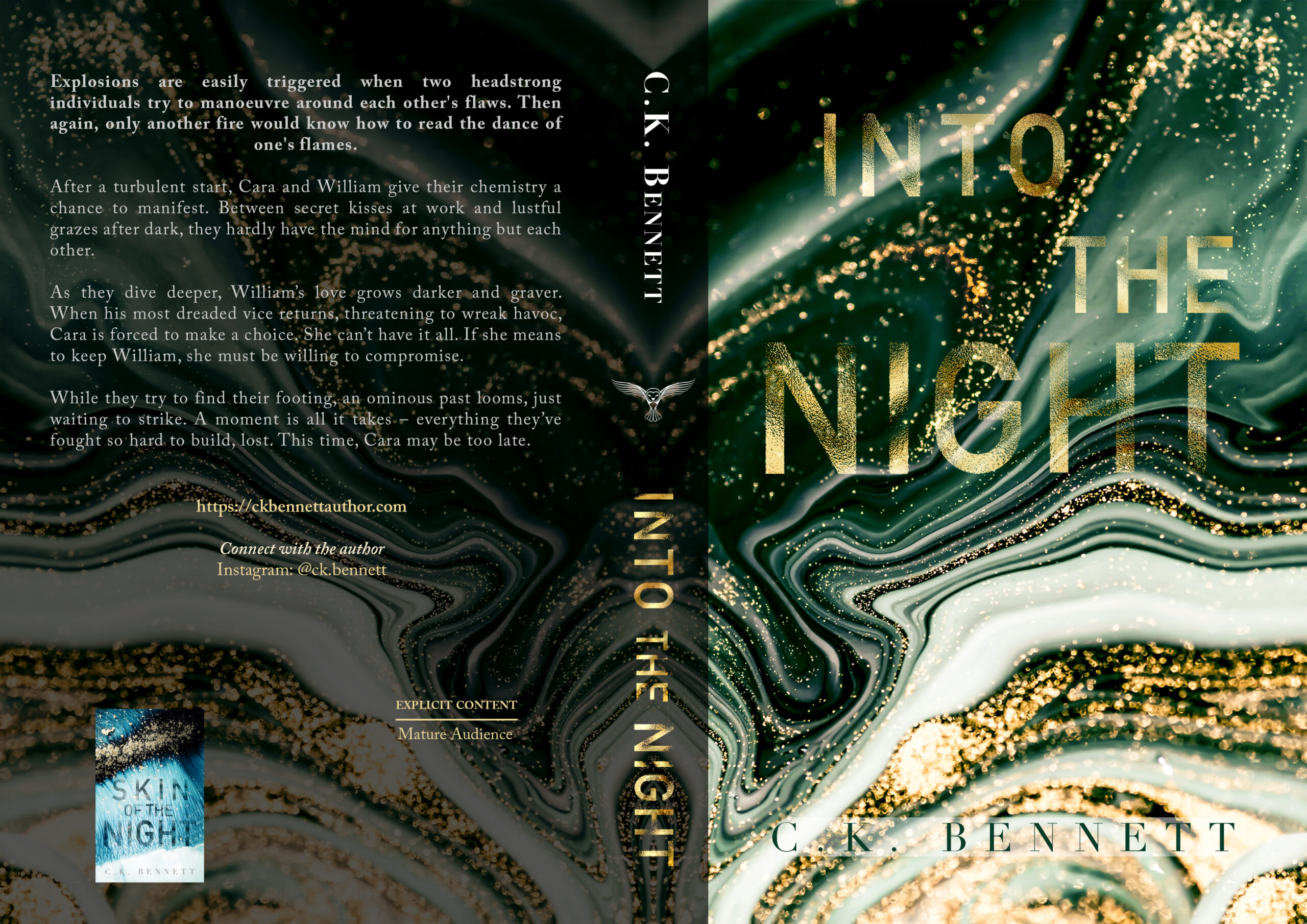
As mentioned before, the titles of The Night series are progressive. In this instalment, Bennett dives deeper into the characters by putting a greater emphasis on William and Cara’s thoughts and feelings as they explore each other. Since Into the Night aims to go beyond William’s surface (beyond his “skin”), Bennett chose to remove the handprint that is present on the cover of Skin of the Night (The Night, # 1).
Cara said it best: “I was enjoying his body, but, somehow, it felt much deeper than that. It went beyond the shallow surface of the skin. I was experiencing his existence – every fragment of the stardust he was composed of, every whisper of his thoughts, and every heartbeat of his emotions. When our bodies moved as one, it was like our individual chemistry combined at a celestial level, and the result was a higher force that could never be undone.”
As Cara gets to know William better, more and more of his core shines through, and what she finds there is golden, hence the gold texture of the title. Gold is, in fact, stardust, which is why Bennett thought it would be suitable to use this. And, as is true for the cover of Skin of the Night, gold is a colour frequently associated with stars, which is what one typically finds within the night. Bennett wanted to give more attention to gold and stars on this cover since Cara begins to view William as a “guiding light”, arriving in her life like “the birth of a star”. Additionally, Bennett wanted the text to look like it was fading a bit to hint toward how Cara is being “consumed by the night”.
You might also notice the number of layers in the artwork. There are several shades of green, white, and black, blending throughout, which is supposed to allude to how layered William is.
“My heart hammered. He never ceased to astound me. There was such remarkable depth to him – so many layers that I couldn’t wait to peel away. Sometimes, when his core shone through, the beauty of it blinded me.”
Now, why did Bennett pick green?
The colour is frequently associated with jealousy. In William’s chapters, you get a taste of how dark his jealousy is when it comes to Aaron and Cara. There might be lots of beauty (gold) to be found beneath William’s surface, but there is also plenty of darkness (black), light (white), and jealousy (green).
Now, if you look at the artwork from above, you might notice the shape of a butterfly, or as Bennett likes to think of it, a moth. This instalment is all about Cara and William’s explosive chemistry, their fiery personalities, their sizzling passion, like stars that never stop burning – moths drawn to each other’s flames.